
From Italy to the Kremlin: how one Italian invented the world's main "thermometer of inequality"
What is the Gini coefficient and where did it come from?
Imagine a society where one person owns absolutely everything, while the others have nothing. This is absolute inequality. Now imagine the opposite situation: the salary of a janitor and a top manager is absolutely the same. This is a world of absolute equality.
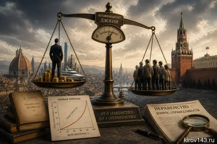
In 1912, Italian statistician Corrado Gini devised a way to measure any intermediate state between these two extremes. Thus, the coefficient named after him was born. It is expressed as a number from 0 (complete equality) to 1 (complete inequality).
The indicator is calculated based on a graph called the "Lorenz curve." On one axis, the share of the population (from the poorest to the richest) is plotted, and on the other, the share of total income that this group receives. If 20% of the population receives 20% of the income, the curve coincides with the line of complete equality. However, if the poorest 20% receive only 5% of the income, the curve bends, and the more pronounced this bend, the higher the inequality.
Why has it been talked about now?
Interest in the Gini coefficient in Russia surged after the publication of "Kommersant" on May 3, 2026. The publication reported that Rosstat is implementing an additional method for calculating this indicator. The key change: now taxes paid will be deducted from incomes, and adjustments will be made for price differences across regions.
Why is this important? Because presidential decrees explicitly state the goal: to reduce the Gini coefficient to 0.37 by 2030. Under the old calculation method (0.422 in 2025), the task seemed almost impossible. The new methodology, which takes into account the progressive income tax scale and regional prices, immediately lowers the indicator to 0.375 — the goal is almost achieved.
Where in the world are the richest poor, and where are the poor rich?
The Gini coefficient is a global standard. It is used by the World Bank, the UN, the CIA, and national statistical services. Here is what the inequality map of the world looks like:
South Africa — 0.63 (highest indicator)
Namibia — 0.59
Colombia — 0.55
USA — about 0.41
China — about 0.42
Russia (old method) — 0.422
Russia (new method) — 0.375
European Union (on average) — about 0.30
And here are the most "equal" countries in the world: Slovakia (0.241), Slovenia (0.243), and Belarus (0.244).
What's the catch?
Corrado Gini himself warned: the coefficient speaks only of one slice of reality. It measures relative inequality but not absolute poverty. A paradox is possible: the incomes of the poorest segments may grow, but the rich become richer even faster — and the Gini coefficient rises, even though the lives of the poor have improved.
Experts also remind us: the coefficient does not account for shadow incomes and the difference between income and consumption. Therefore, debates about the "correct" calculation methodology continue in other countries as well.
One thing is certain: as long as governments set goals regarding inequality, the Gini coefficient will remain the main tool for measuring fairness. And the Italian statistician who devised it in the early 20th century continues to influence global politics even a century later.
Другие Новости Кирова (НЗК)
 Что известно о незрячих людях — интервью с директором «Невидимый мир»
Что мы узнаем о слепых людях — интервью с директором «Невидимого мира»
Что известно о незрячих людях — интервью с директором «Невидимый мир»
Что мы узнаем о слепых людях — интервью с директором «Невидимого мира»
 В Кировской области обновили методы контроля за таксомоторными услугами.
В Кировской области обновили методы контроля за такси.
В Кировской области обновили методы контроля за таксомоторными услугами.
В Кировской области обновили методы контроля за такси.
 В Кировской области пересмотрели методы контроля за таксомоторными услугами.
В Кировской области пересмотрели методы контроля за таксомоторными перевозками.
В Кировской области пересмотрели методы контроля за таксомоторными услугами.
В Кировской области пересмотрели методы контроля за таксомоторными перевозками.
 The "Victory Train" has arrived in Kirov.
The composition was met by the Minister of Culture.
The "Victory Train" has arrived in Kirov.
The composition was met by the Minister of Culture.
 Кировским предпринимателям напомнили о необходимых условиях для функционирования сезонных кафе.
Кировским предпринимателям напомнили о требованиях для функционирования сезонных кафе.
Кировским предпринимателям напомнили о необходимых условиях для функционирования сезонных кафе.
Кировским предпринимателям напомнили о требованиях для функционирования сезонных кафе.
 Кировская компания начала реализацию проекта по изготовлению контейнерных площадок для твердых бытовых отходов.
Кировская компания инициировала проект по изготовлению контейнерных площадок для твердых бытовых отходов.
Кировская компания начала реализацию проекта по изготовлению контейнерных площадок для твердых бытовых отходов.
Кировская компания инициировала проект по изготовлению контейнерных площадок для твердых бытовых отходов.
From Italy to the Kremlin: how one Italian invented the world's main "thermometer of inequality"
In May 2026, the topic of inequality in Russia unexpectedly became one of the most discussed. Rosstat proposed to calculate the Gini coefficient in a new way, which suddenly made Russian society "more equal." However, few know what lies behind this indicator and why the whole world trusts it.